Node.js/MyTodoList
[Node.js] 04. CSS와 SCSS
hyun_ji
2021. 7. 9. 08:46
반응형
SMALL
우선 브라우저에서 기본적으로 적용시키는 css를 리셋시키고 직접 작업을 하기 위해 index.css에서 초기화를 시켜줍니다.
(정석이 아닌 제 커스텀이니 여러분이 원하는 항목은 스스로 수정해서 커스텀하시기 바랍니다.)
@charset "utf-8";

/* Webfont Setting :
  1. font-family: 'Roboto', sans-serif;
  2. font-family: 'Nanum Gothic', sans-serif;
  3. font-family: 'Open Sans', sans-serif;
  4. font-family: 'Lato', sans-serif;
  5. font-family: 'Noto Sans KR', sans-serif;
  6. font-family: 'Teko', sans-serif;
  7. font-family: 'Teko', sans-serif;
*/
@import url('https://fonts.googleapis.com/css?family=Lato:100,300,400,700|Nanum+Gothic:400,700|Noto+Sans+KR:100,300,400,500,700|Fredericka+the+Great|Zilla+Slab:300,400|Open+Sans|Teko:wght@300;400;500;600;700&|Roboto:100,300,400,500,700&display=swap');

* {
  margin: 0;
  padding: 0;
  box-sizing: border-box;
}

html {
  font-size: 10px;
}

body {
  font-family: 300 'Noto Sans KR', sans-serif;
  font-size: 1.4rem;
}

h1,
h2,
h3,
h4,
h5,
h6 {
  margin: 0;
  padding: 0;
}

p {
  line-height: 1.5;
}

ul,
ol {
  list-style: none;
}

dl,
dd,
dt {
  margin: 0;
  padding: 0;
}

a {
  color: #000;
  text-decoration: none;
}

table,
tr,
th,
td {
  /* border: 1px solid #000; */
  border-collapse: collapse;
}

caption {
  width: 100%;
  height: 30px;
  line-height: 30px;
  font-size: 1.2rem;
}

fieldset {
  border: 0;
}

/* legend,
label {
  display: block;
  width: 1px;
  height: 1px;
  font-size: 1px;
  text-indent: -9999px;
  overflow: hidden;
  margin: 0;
  padding: 0;
} */

input,
label {
  vertical-align: middle;
}

button {
  background: none;
  border: none;
  cursor: pointer;
}

button,
input {
  outline: 0;
}


/* Help Class Setting */
/* ir(image replace) - 이미지 대체(치환)기법 */
.ir {
  display: block;
  width: 100%;
  height: 100%;
  text-indent: -9999px;
  overflow: hidden;
  background: no-repeat 0 0;
}

/* 플롯해제 클래스 */
.clearfix::after {
  content: '';
  display: block;
  clear: both;
}

/* 화면 감추기 클래스 */
.screen-hidden {
  display: block;
  width: 1px;
  height: 1px;
  font-size: 1px;
  text-indent: -9999px;
  overflow: hidden;
  margin: 0;
  padding: 0;
}
그리고 App.css에 이 코드를 붙여넣으세요.
body {
  height: 100vh;
  display: grid;
  place-items: center;
  font: 300 1.8rem/1.5 'Noto Sans KR', sans-serif;
  background-color: #f9d3e0;
}

/* SCROLL */
::-webkit-scrollbar {
  width: 10px;
}

/* 스크롤바의 width */
::-webkit-scrollbar-track {
  background-color: #fff;
}

/* 스크롤바의 전체 배경색 */
::-webkit-scrollbar-thumb {
  background-color: #f9d3e0;
}

/* 스크롤바 색 */
::-webkit-scrollbar-button {
  display: none;
}

.App {
  height: 80vh;
  width: 500px;
  padding: 40px 50px;
  background-color: #fff;
  border-radius: 5px;
  overflow-y: auto;
  box-shadow: -1px -1px 15px 9px rgb(0 0 0 / 3%), -1px -1px 15px 9px rgb(0 0 0 / 3%), -1px -1px 15px 9px rgb(0 0 0 / 3%), -1px -1px 15px 9px rgb(0 0 0 / 3%);
}

.App h2 {
  margin-bottom: 30px;
  text-align: center;
  font: 700 5rem/1.3 "fredericka the great", cursive;
  font-style: italic;
  color: #f9d3e0;
}

form {
  display: flex;
  width: 100%;
  align-items: center;
}

.App .write {
  height: 30px;
  margin-bottom: 30px;
}


.App .todo_input {
  height: 30px;
  font: 300 1.8rem/1.5 'Noto Sans KR', sans-serif;
  color: #A9ABAE;
  width: 80%;
  border: inherit;
  border-bottom: 2px solid #f9d3e0;
  background-color: transparent;
  color: #000;
  padding-left: 5px;
}

.App .submit_btn {
  width: 20%;
  height: 30px;
  color: #fff;
  text-transform: uppercase;
  display: inline-block;
  background-color: #f9d3e0;
  line-height: inherit;
  text-decoration: none;
  cursor: pointer;
  border-radius: 0;
}

.list {
  display: flex;
  justify-content: space-between;
  align-items: center;
  margin-bottom: 10px;
  width: 100%;
  height: 50px;
  padding: 15px;
  margin-bottom: 20px;
  border-radius: 5px;
  box-shadow: 1px 1px 5px 3px rgb(0 0 0 / 10%);
}

.list .title {
  width: 100%;
  display: flex;
  align-items: baseline;
}

.list .title h3 {
  width: 90%;
  font: 300 1.8rem/1.5 'Noto Sans KR', sans-serif;
  color: #000;
  position: relative;
  text-transform: uppercase;
  display: block;
}

.list .title h3::before,
.list .title h3::after {
  content: '';
  border-bottom: solid 1px #f9d3e0;
  position: absolute;
  left: 0;
  bottom: 0;
  width: 0;
  -webkit-transition: all 0.4s ease;
  transition: all 0.4s ease;
}

.list .title h3::before {
  left: 0;
}

.list .title h3::after {
  right: 0;
}

.list .title h3:hover::before,
.list .title h3:hover::after {
  width: 100%;
}

.list .check {
  margin-left: 20px;
  width: 40px;
}

.list .btn {
  margin-left: 20px;
  transition: opacity ease .5;
}


/* .list .icon {
  width: 20px;
  margin-right: 5px;
} */

.list p {
  margin-right: 10px;
  color: #f9d3e0;
  font: 300 2rem/1.3 'Teko', sans-serif;
}

.list button {
  justify-content: right;
  width: 20px;
  height: 20px;
}

.list .button {
  position: relative;
  z-index: 2;
  box-sizing: border-box;
  float: right;
  width: 20px;
  height: 20px;
  border: 1px solid #f9d3e0;
  border-radius: 50%;
  cursor: pointer;
}

textarea {
  padding-left: 5px;
  width: 100%;
  resize: none;
  height: 30px;
  font: 300 1.8rem/1.5 'Noto Sans KR', sans-serif;
  border: inherit;
  border-bottom: 2px solid #f9d3e0;
  outline: none;
}

.btn {
  display: flex;
}

.btn button {
  color: #f9d3e0;
  font: 500 3rem/25px 'Teko', sans-serif;
}
짜잔~ 멋진 화면이 완성되었군요.

이제 SCSS를 이용해 체크박스도 커스텀해봅시다~
클라이언트에 sass를 설치합니다.
$ npm i sassApp.scss파일을 src안에 생성하신 후, App.js에 import시킵니다.
import './App.scss';
import './App.css';
import {Main} from './component/Main.jsx'
import {ListManage} from './component/ListManage.jsx'

const App = () => {
  return (
    <div className="App">
      <h2>Todo List</h2>
      <Main />
      <ListManage />
    </div>
  );
}

export default App;
마지막으로 App.scss에 이 코드들을 복사, 붙여넣기 합니다.
/* Made by Jimmy Gillam */
$checked-color: #f9d3e0;
$unchecked-color: #f9d3e0;
$checkbox-height: 25px;
$background-color:#667788;
$font-color:#efefef;
$duration: .4s;


/* Checkmark style starts */

@-moz-keyframes dothabottomcheck {
  0% {
    height: 0;
  }

  100% {
    height: $checkbox-height/2;
  }
}

@-webkit-keyframes dothabottomcheck {
  0% {
    height: 0;
  }

  100% {
    height: $checkbox-height/2;
  }
}

@keyframes dothabottomcheck {
  0% {
    height: 0;
  }

  100% {
    height: $checkbox-height/2;
  }
}

@keyframes dothatopcheck {
  0% {
    height: 0;
  }

  50% {
    height: 0;
  }

  100% {
    height: $checkbox-height * 1.2;
  }
}

@-webkit-keyframes dothatopcheck {
  0% {
    height: 0;
  }

  50% {
    height: 0;
  }

  100% {
    height: $checkbox-height * 1.2;
  }
}

@-moz-keyframes dothatopcheck {
  0% {
    height: 0;
  }

  50% {
    height: 0;
  }

  100% {
    height: $checkbox-height * 1.2;
  }
}

input[type=checkbox] {
  display: none;
}

.check-box {
  height: $checkbox-height;
  width: $checkbox-height;
  background-color: transparent;
  border: $checkbox-height * .1 solid $unchecked-color;
  border-radius: 50%;
  position: relative;
  display: inline-block;
  -moz-box-sizing: border-box;
  -webkit-box-sizing: border-box;
  box-sizing: border-box;
  -moz-transition: border-color ease $duration/2;
  -o-transition: border-color ease $duration/2;
  -webkit-transition: border-color ease $duration/2;
  transition: border-color ease $duration/2;
  cursor: pointer;

  &::before,
  &::after {
    -moz-box-sizing: border-box;
    -webkit-box-sizing: border-box;
    box-sizing: border-box;
    position: absolute;
    height: 0;
    width: $checkbox-height * .2;
    background-color: $checked-color;
    display: inline-block;
    -moz-transform-origin: left top;
    -ms-transform-origin: left top;
    -o-transform-origin: left top;
    -webkit-transform-origin: left top;
    transform-origin: left top;
    border-radius: 5px;
    content: ' ';
    -webkit-transition: opacity ease .5;
    -moz-transition: opacity ease .5;
    transition: opacity ease .5;
  }

  &::before {
    top: $checkbox-height * .72;
    left: $checkbox-height * .41;
    transform: rotate(-135deg);
  }

  &::after {
    top: $checkbox-height * .37;
    left: $checkbox-height * .05;
    -moz-transform: rotate(-45deg);
    -ms-transform: rotate(-45deg);
    -o-transform: rotate(-45deg);
    -webkit-transform: rotate(-45deg);
    transform: rotate(-45deg);
  }
}

input[type=checkbox]:checked+.check-box,
.check-box.checked {
  border-color: $checked-color;

  &::after {
    height: $checkbox-height * .5;
    -moz-animation: dothabottomcheck $duration/2 ease 0s forwards;
    -o-animation: dothabottomcheck $duration/2 ease 0s forwards;
    -webkit-animation: dothabottomcheck $duration/2 ease 0s forwards;
    animation: dothabottomcheck $duration/2 ease 0s forwards;
  }

  &::before {
    height: $checkbox-height * 1.2;
    -moz-animation: dothatopcheck $duration ease 0s forwards;
    -o-animation: dothatopcheck $duration ease 0s forwards;
    -webkit-animation: dothatopcheck $duration ease 0s forwards;
    animation: dothatopcheck $duration ease 0s forwards;
  }
}
자, 이제 확인해볼까요?

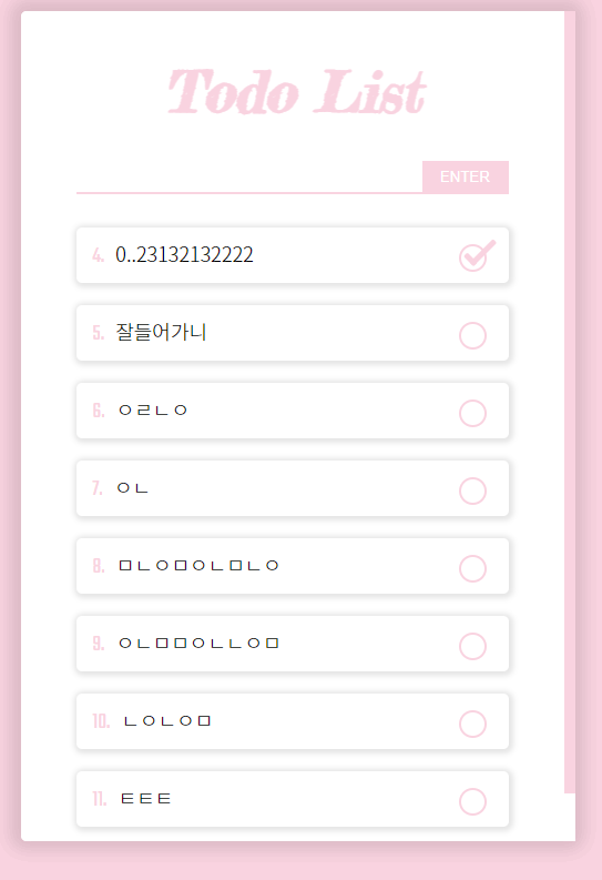
scss가 잘적용되었네요.
이로써 나만의 투두리스트 만들기 완성~!!!!!!!!!!!
따라오신 여러분 수고하셨습니다☺
시퀄라이즈(Sequelize) 를 경험해보고 싶은 분들은 다음 차수도 따라와주세요~
반응형
LIST